THE RESULT YOU'RE WORKING TOWARD
Done means it works.
A keyboard user can open the menu, reach every link, close it and continue through the page.
Practice project: Harbor Home Care01 / GET READY
Before you start.
- Platform / editor
- HTML, CSS and JavaScript; Python local preview server
- Access & plan
- Text editor, modern browser and Python for local preview. Hosting and form-backend accounts are needed only for their corresponding lessons.
- Starting point
- Complete the previous lesson or use an equivalent prepared demo project.
Keep a note of the exact account, project and version you use. Work with demo data and record the expected result before making changes. Never place passwords, verification codes or private customer records in your evidence.
Download website starter ↘ Open completed static example ↗02 / LEARN THE TOOL
Open the official walkthrough.
Use the publisher's instructions and available screenshots to locate the current controls. Then return here for the SETLY exercise and its result checks. These links open on the publisher's website.
Source credit belongs to the named publisher. These are external references, not SETLY recordings or a claim of affiliation. Screen names and plan availability can change.
03 / PUT IT INTO PRACTICE
Your task, step by step.
Use one labelled demo record or project so you can find your work again. Finish each action before continuing; if the screen differs, consult the matching official source rather than guessing.
- 01
Step 1
Start with semantic links to Home, Services and Contact. Keep the navigation visible without JavaScript.
- 02
Step 2
For a collapsed menu, use a button with an accessible name and aria-expanded. Connect it to the navigation container using aria-controls.
- 03
Step 3
In script.js, toggle the menu state and update aria-expanded together. Close it on Escape and return focus to the toggle when appropriate.
- 04
Step 4
Test with Tab, Enter and Escape at narrow width. Resize to desktop and ensure links remain available.
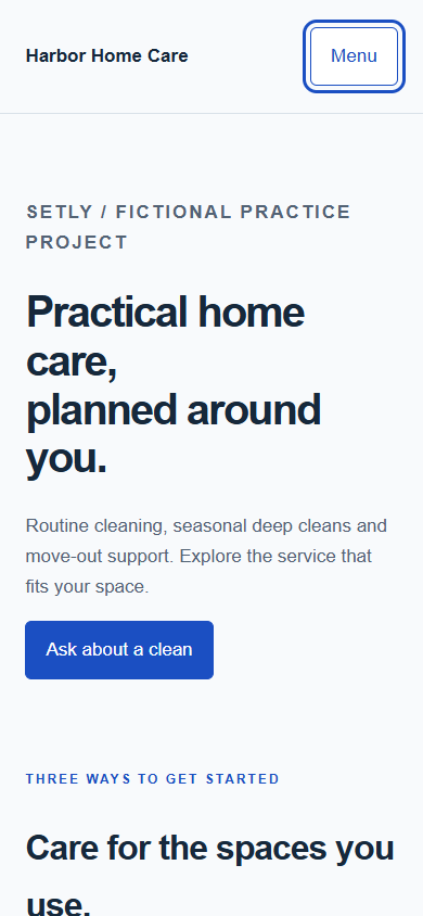
Captured from the supplied website example. The static contact form needs a backend; the downloadable educational backend stores demo enquiries locally.
Source: Ray / SETLY. Original SETLY example.
04 / GET UNSTUCK
If something goes wrong.
Start with the likely cause
If a menu is visually hidden but still receives focus, align its hidden state with keyboard behavior instead of only moving it off-screen.
My screen is different from the guide
Check the product, editor, account role and selected project first. Open the credited official instructions for your version. Record the difference and pause any action whose effect you cannot verify.
The screen looks correct, but the result is missing
Inspect the saved record, published page or execution log that should prove the action. A preview, success message or draft is not always evidence that data was stored or a message was delivered. Retest with one unique demo value.
05 / PROVE THE RESULT
Check it before you call it done.
A keyboard user can open the menu, reach every link, close it and continue through the page.
Keep useful evidence
Record the test date, project/version, expected result, observed result and a non-sensitive screenshot or record reference. Mark anything you did not test as untested. Your checkmarks do not certify an untested result.
Download the editable verification checklist ↓Guide status: original written practice exercise with credited external references. SETLY screen recording and independent learner reproduction are not yet complete.